Google har blitt så mye mer enn enn en hvit nettside med en tekstboks. Vi samhandler med søk, kart, Android, Gmail, og et dusin andre Google-produkter – på utallige måter for utallige formål. Mer enn noen gang er Google stadig til stede i livene våre. Det kan være skremmende – spesielt når du husker at selskapet vet mer om oss enn vi vet om oss selv.
Dette forklarer at Google nå kommer med ny logo. Selskapet ønsker at du skal tenke på det – ikke som allvitende, allmektig, men som en velvillig guide til denne nye verden, en som anser mennesker, og ikke maskiner, som det viktigste…
(Artikkelen er hentet fra Wired)
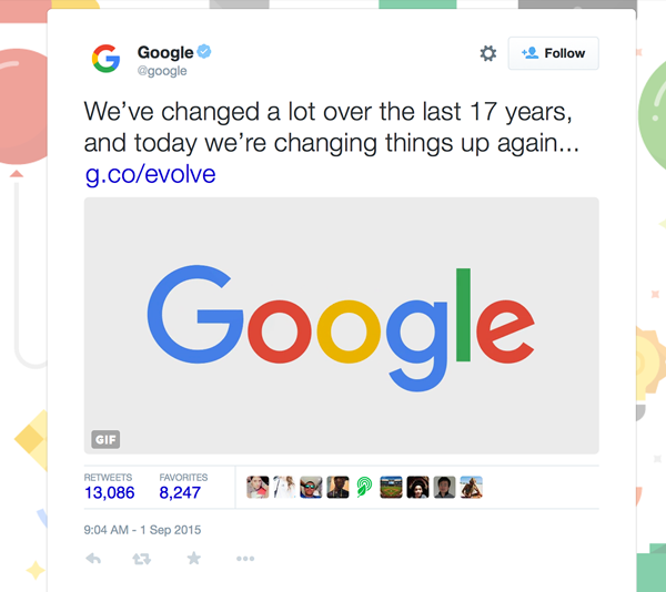
The bold new logo preserves the old logo’s most recognizable element – the famous blue-red-yellow-blue-green-red color sequence – but presents the company’s name in a bespoke typeface called Product Sans inspired by schoolbook letter-printing. The new wordmark will replace the one that’s appeared above the search box since 1999, but it’s much more extensible, too. Google also introduced a suite of sub-logos, like a four-color ‘G’ icon that’ll dot the Google app on phone homescreens, and a microphone icon that guides you through voice search. It’s a self-described “simple, friendly, and approachable” design.
“Digital interfaces can be scary for a lot of people,” says Nate Clinton, director of product strategy at Cooper design firm. “Google has a big challenge with both their public perceptions and new anxiety-producing technologies … so I think they want to project a tone and make people feel like they are more human and less about being in the guts of the computer.”
This is what tech companies do these days: rethink their graphics for a mobile-first world, simplify everything, and dub the new identity “friendly.” And it is, indeed, a friendly gesture. By stripping serifs from letterforms and kerning and tweaking for crisper edges, designers can optimize fonts for small screens, and make life easier on everyone.
“It’s really about much more than a logo, and more about kind of a smart system,” says Geoff Cook, a founding partner at Base Design. That’s partly a nod to Alphabet, the newly minted holding company that now owns Google and has a slick and simple visual identity of its own. In creating Alphabet, Google executives introduced a new ecosystem—one that Google is part of, rather than one Google oversees. In many ways, Google’s new design language mirrors its parent company’s, raising the question if this is the future of everything from Calico to Youtube.
It wouldn’t be surprising. After all, Google’s new logo is all about where the world is going: mobile, simple, and accessible everywhere.
Googles utvikling: https://youtu.be/olFEpeMwgHk
A System, Not a Logo
The logo’s animated reveal is telling. Pay particular attention to the ease with which the new block letterforms morph into a row of dots, the square “G” for the app, or even that microphone button. That wouldn’t have been possible with the old logomark because of the varying thickness of the lines in the serif letters. Sans-serif fonts often are described as less warm than their more ornate counterparts, but there’s still plenty of charm in the logo. And losing the serifs makes life easier for designers. “It’s much easier to manipulate something that’s all one weight,” says Paula Scher, a partner at Pentagram (and the designer behind Shake Shack’s branding). “That’s why sans-serif types were designed in the first place.”
Google needs to be able to transform its brand at will, because its canon of products is expanding rapidly. It’s not just that users now engage with the company on a “constellation of devices,” as the authors of the logo announcement page put it. As we saw at the I/O developer conference, Google is pushing to seamlessly guide users from one product to the next, with things like Google Now on Tap and voice search as the connective tissue that will bring it all together. For that to work, Google needs a crisp visual system. The new design helps, Clinton says, because the typeface is based largely on circles.
“It’s all about organic, round shapes, like your fingertip, which is more circular,” he says. “It makes it feel like there’s some DNA, or molecules, or building blocks.” There’s an emotional component to the new look, too. Google’s old logo was often dubbed “quirky,” but this new identity is more youthful and exuberant. On the logo’s announcement page, Alex Cook, Jonathan Jarvis, and Jonathan Lee say more than once that the new typeface and look took cues from schoolhouse lettering. Likewise, the Google Doodle used to unveil the logo features a Shel Silverstein-like sketch of a hand drawing in sidewalk chalk.
The G thing
The logo’s getting a lot of love. Design critic Steven Heller is a fan—“For the first time in years, I feel good about a redesign of a corporate logo,” he says—but also notes that, like any logomark, this one will have to evolve along with the Internet and how we use it. Some of that remains to be seen, but what’s clear is that four-color “G” logo will become Google’s most prominent insignia, because it’ll be the mobile portal to the company’s services.
Over time, the crisper “G” could become akin to Apple’s apple—the only icon needed to represent the company. It would certainly be in line with recent trends, as companies from Yahoo and Netflix to Twitter and Snapchat have simplified their logos. But not everyone sees that move as an asset. Jim Parkinson, founder of Type Design, “favors more expressive letterforms.” Others point out that color, not typeface, always has been essential to Google’s voice as a brand. “I would be disappointed if they lost the Google colors, because that’s part of their charm,” Scher says.
That said, the singular “G” keeps the palette, and its charms seem to be working. “It’s happy and friendly,” Scher says. And that’s entirely the point.


